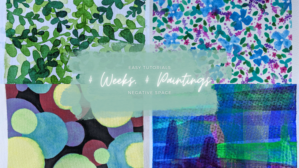
Welcome to another instalment in the 4 Weeks, 4 Paintings mini-series!
Today, we’ll learn more about using negative space in our paintings by building on the foundation of layering.
As I mentioned in the Layered Foliage tutorial, we must often paint the lightest shades first when working with watercolours, then build the pigment layer by layer. Negative space art uses the same technique—we’ll paint from the lightest shade upward, creating the same illusion of depth as we achieved last week while layering, but this time, the lightest shades will be at the fore- instead of the background of the painting.
This technique teaches utilising the space we usually ignore, and a better understanding of how depth and shadows work in art.
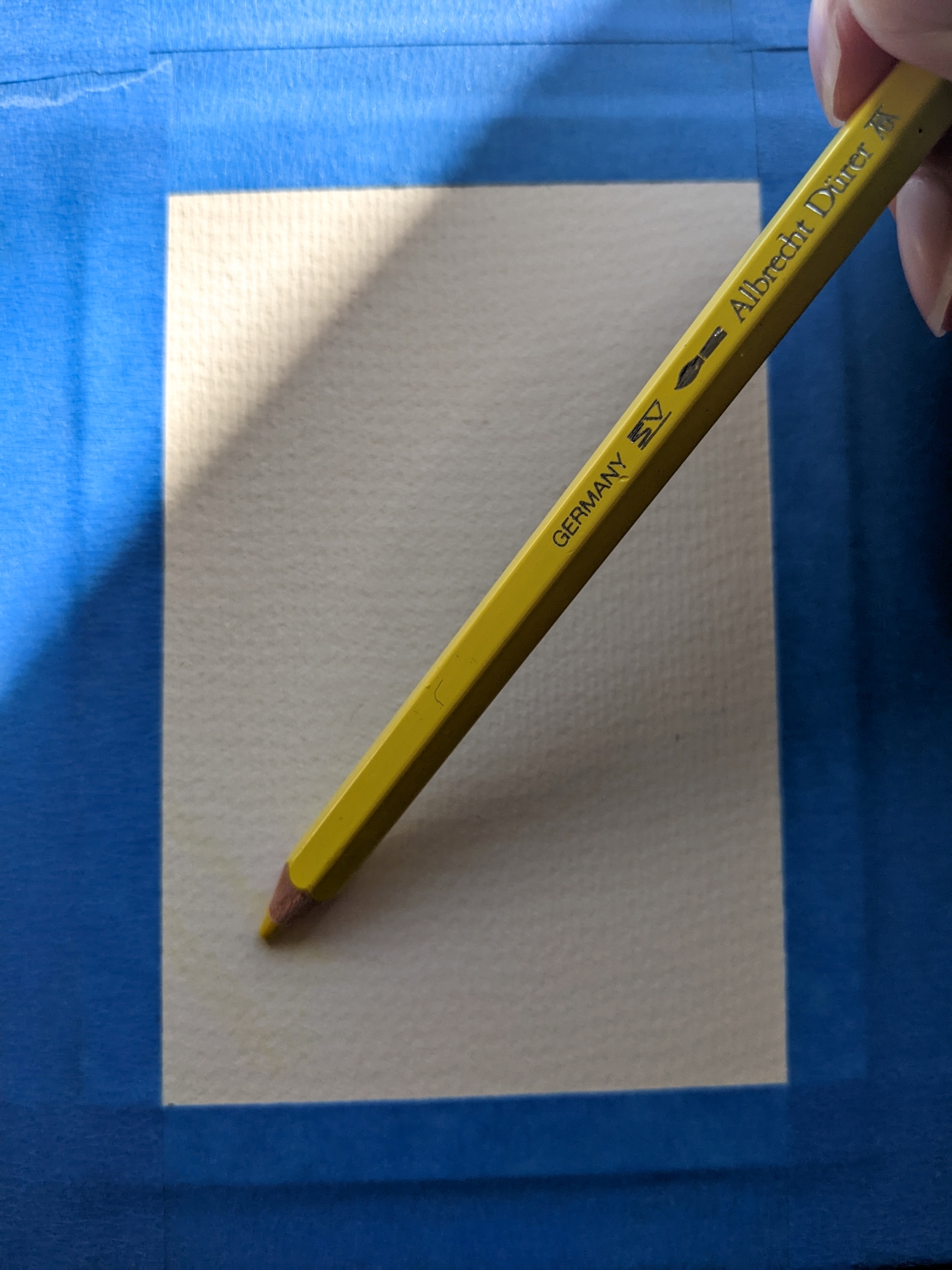
Before starting, I stretched a sheet of watercolour paper.
You’ll Need:
- Your chosen medium. For this post, I used Farber Castell Albrecht Durer Watercolour Pencils in Cadmium Yellow, Deep Scarlet Red, Purple Violet, Ultramarine, and Emerald Green. I also used gouache in Lamp Black. I specifically chose the pencils for this technique because they offer a bit more control. Sketching out negative space can be tricky in the beginning, but once we have a firm grasp on the technique, it gets easier. I also chose rainbow colours to illustrate the progression from layer to layer more clearly, but this technique works beautifully in greyscale or the same colour family, too!
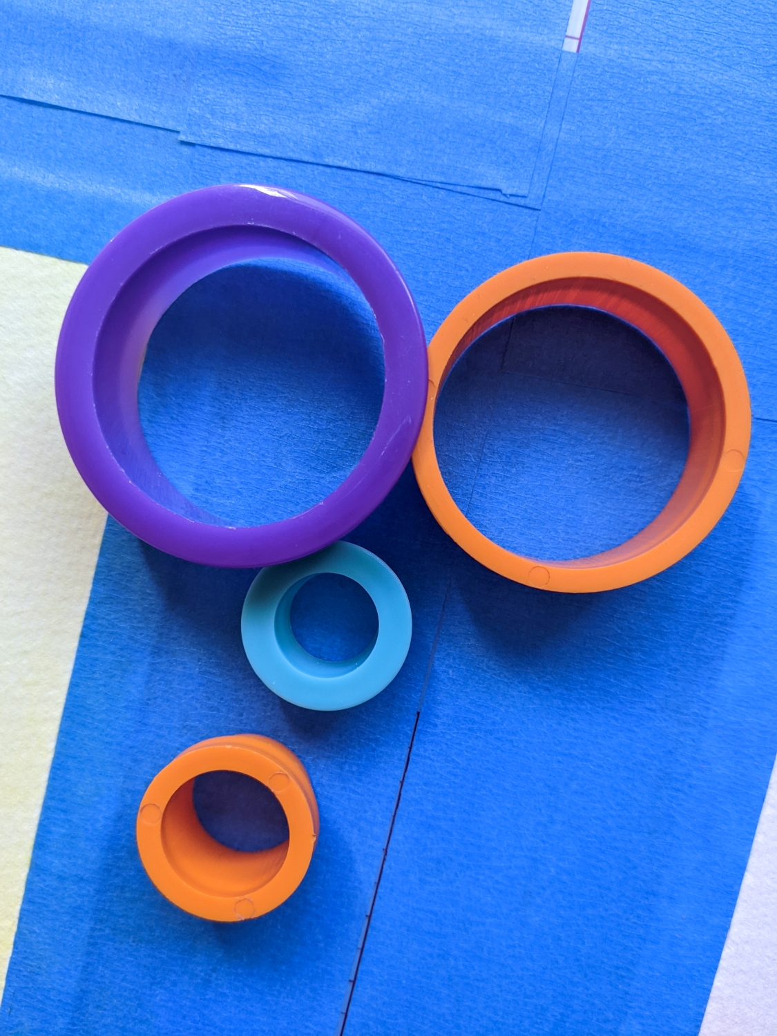
- Circular objects to trace. I chose an easy shape for this tutorial, but you could paint florals, vines, fish, birds—whatever your heart desires. I’ll share examples of other negative space paintings I’ve created at the end of the post.
- A paintbrush. I used a #8 round watercolour brush.
- A painting surface. I used 140lb/300gsm cold-pressed, cellulose-based watercolour paper, which I secured with regular painter’s tape.
- Water with which to activate the pigment. If you’re using watercolours, I’d recommend 2 water sources, 1 for cleaning the brush, and another with clear water for mixing.
Step 1
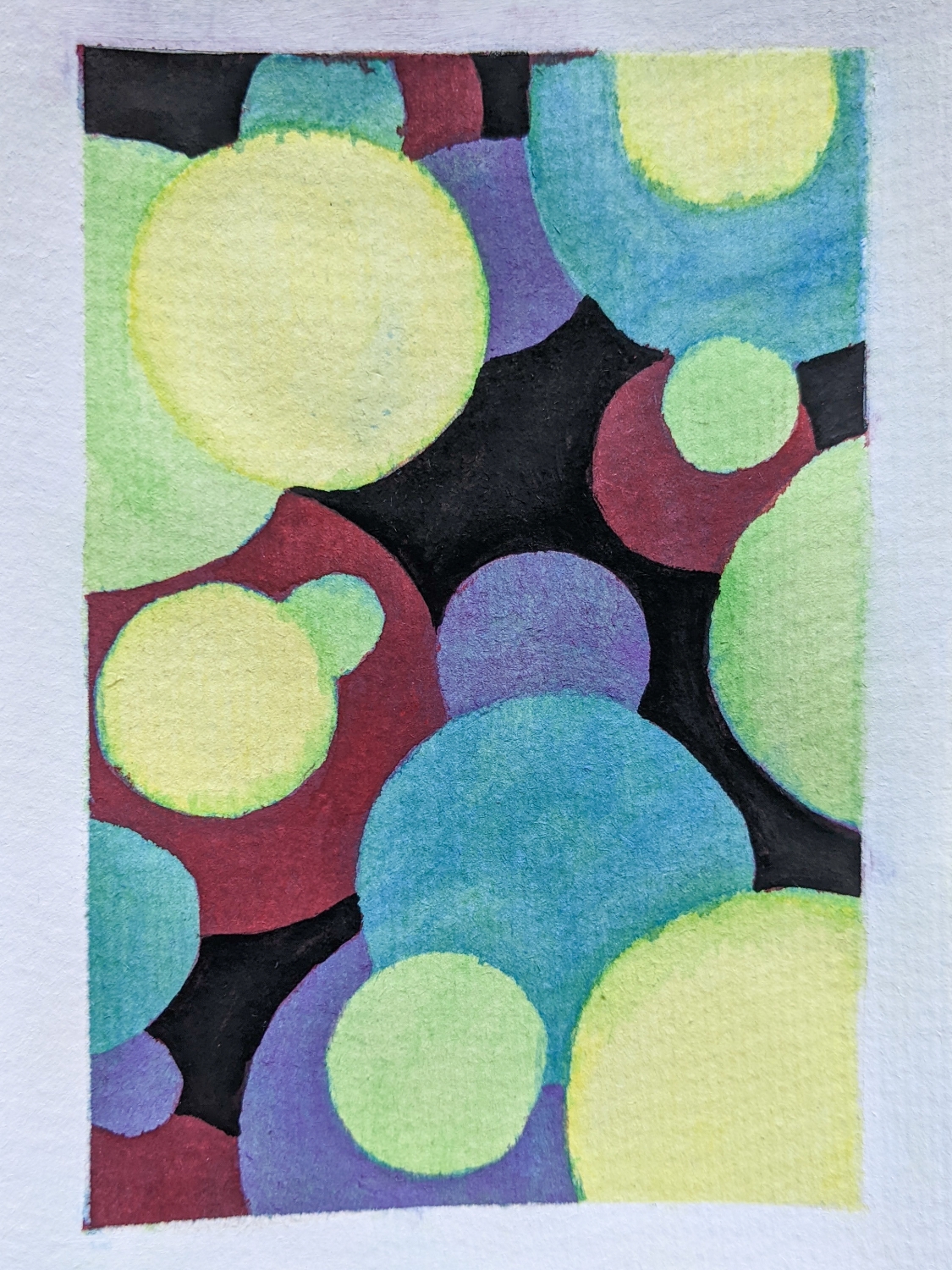
Cover the entire page with the lightest shade, in this case, Cadmium Yellow. I activated the pigment by painting a thin layer of water over it and then allowing the paper to dry completely before I continued.


Step 2
Trace circles onto your canvas, but don’t fill the entire page. Every shape we paint on this first layer will form our foreground, and every following layer will go around whatever we add now, pushing it more firmly to the front.
Once we’ve plotted the position of our circles, we’ll colour the entire area around them with Emerald Green, and activate the pigment with water.


I wasn’t happy with the vibrancy of the yellow I’d painted in the first layer, so I darkened my circles until they showed up better on camera. I also added a second layer of green and allowed the paper to dry completely before I moved on to the next step.
Step 3
Trace more circles, allowing some of them to overlap with the ones we drew in Step 2.
The most important thing to remember now is that every new circle is behind the ones we’ve already painted.
Once we’ve plotted the layout of our circles, we’ll fill the page with Cerulean, going around the lines of the circles from Step 2. Darkening the area around the circles we’ve already painted will push them further into the foreground.
Activate the pigment with water, and allow the page to dry completely before continuing. I added 2 layers of Cerulean to achieve a more vibrant pigment that shows up better on photos, but you could go for a more dreamy look by adding only one layer of colour to each step.

Step 4
Add more circles. This round of circles is behind the yellow and green ones from the previous layers.
With Purple Violet, colour the area around the previous layers and the circles from this step.
Activate the pigment with water, allow it to dry, darken the colour with a second layer of colour and activate it again. Allow the page to dry completely before continuing to the next step.

Step 5
Draw another layer of circles using Deep Scarlet Red, and colour around the previous layers and everything we’ve plotted out in this layer.
Once again, activate the paint with water and allow the paper to dry before we move on. Repeat the step for extra vibrancy.
I forgot to take a photo of this step. Sorry! But it’s the same as the others, except it has a few purple circles on a red background.
Step 6
This is our last step. Trace a final round of circles—these will be the farthest back in our artwork.
I painted the last layer using Lamp Black gouache, but note that gouache isn’t a good medium for layering techniques as it reactivates when wet. Because this is the final layer, it’s safe to use. Gouache is also super opaque and pigmented, which means I only needed one layer for total cover of the lower layers.

Once we understand the concept of painting from the foreground to the background, we can move on to more complicated shapes. Here are some examples of art I’ve created using this technique.


Until next time.
Yolandie


Let’s Chat!